Hello!
In Japan, mobile devices with a screen width of 375px or less are still very popular. When I looked it up, it was the same throughout the world.
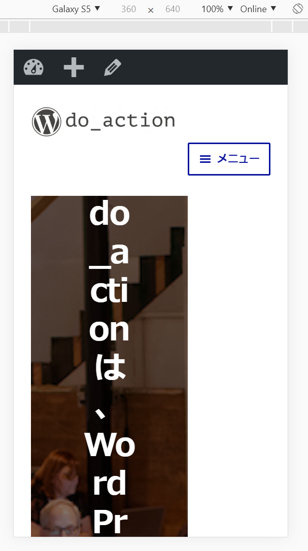
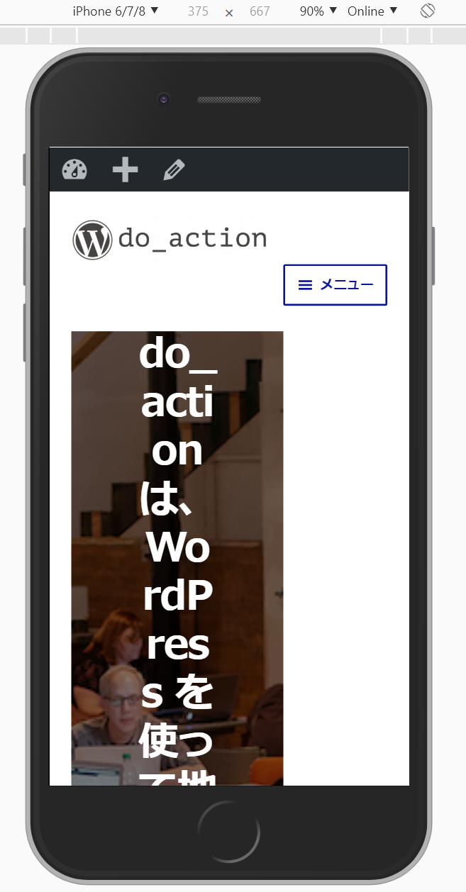
On the following pages, it seems that the screen width is not fully supported. There seems to be no problem with iOS, but the same applies to Android devices.
Target page:
https://doaction.org/ja/
I think you can fix it by applying CSS media queries to the source code of layout collapse, but what about? It seems that you need to write media queries in some other places.
.page-template-template-homepage:not (.has-post-thumbnail) .site-main> .sph-hero:first-child {
   @media screen and (min-width: 376px) {
     margin-top: -4.235801032em;
   }
}
reference data:
https://gs.statcounter.com/screen-resolution-stats/mobile/worldwide
https://gs.statcounter.com/screen-resolution-stats/mobile/japan
Hello!
In Japan, mobile devices with a screen width of 375px or less are still very popular. When I looked it up, it was the same throughout the world.
On the following pages, it seems that the screen width is not fully supported. There seems to be no problem with iOS, but the same applies to Android devices.
Target page:
https://doaction.org/ja/
I think you can fix it by applying CSS media queries to the source code of layout collapse, but what about? It seems that you need to write media queries in some other places.
reference data:
https://gs.statcounter.com/screen-resolution-stats/mobile/worldwide
https://gs.statcounter.com/screen-resolution-stats/mobile/japan